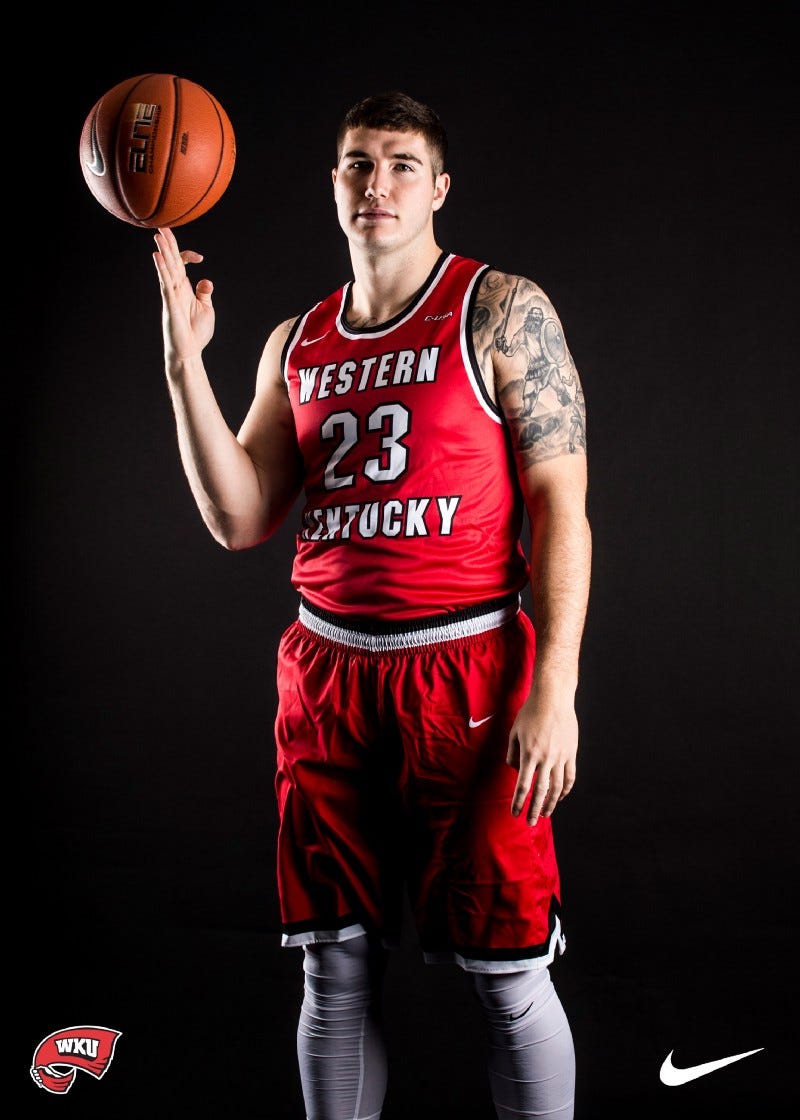
WKU Basketball: Hilltoppers Debut New Nike Uniforms
Early Wednesday morning, WKU basketball debuted their men’s jerseys and they’re…exactly what we said they’d be.
Early Wednesday morning, WKU basketball debuted their men’s jerseys and they’re…exactly what we said they’d be.
Let’s be clear — these jerseys being what we thought they’d be is in no way a bad thing. We know how much Stansbury loves the “Western Kentucky” moniker over “WKU,” so the full time return of the full name was inevitable.
#ProTops: Brandon Doughty Passed Over For Roster Spot. Again.
For the second time this year, and for the second time in as many years, the Miami Dolphins have passed over promoting…medium.com
We even figured out that the words wouldn’t arch around the numbers like in the original jersey, which is fine. I think it works on the white set, but I’d like to see a bit of an arch on the red ones.
At the end of the day, these are quality uniforms and the Tops might just be the best looking team in Conference USA. I, personally, am a bigger fan of the white uniforms — they’re slick as hell and is weird for me, I’m usually a color jersey guy.
What say you? What set is your favorite? Where you pleased, surprised or disappointed? Let us know in a comment below, via Twitter at @TheTowelRackWKU or on our Facebook page.


