WKU Football: Five Takeaways From The Nike Uniforms
On Saturday, WKU football put all the waiting and speculation to bed as the team officially unvield their uniform set for the 2017 football…
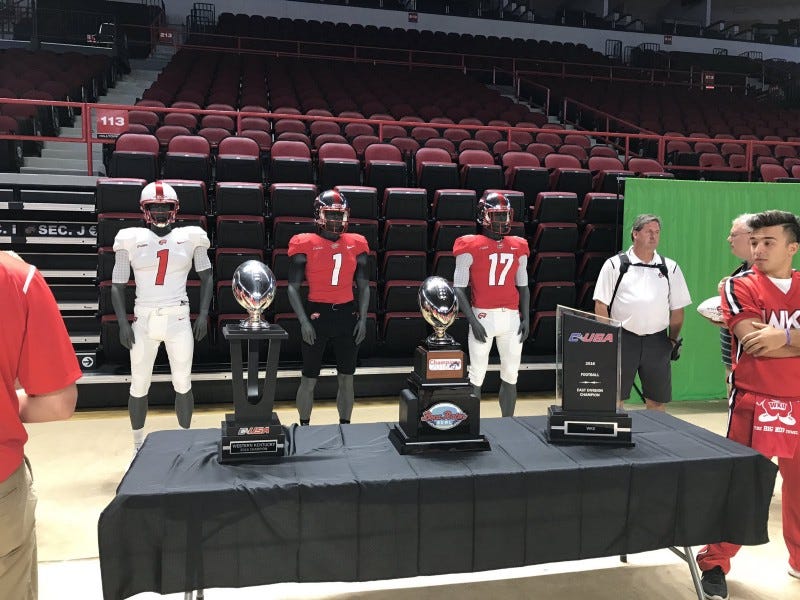
On Saturday, WKU football put all the waiting and speculation to bed as the team officially unvield their uniform set for the 2017 football season, the first to be played under their new deal with Nike as the school’s uniform supplier.
There are basically two schools of thought (although there are folks who lie in various other camps, such as myself ): The uniforms are dope, sleek and awesome or it’s a tremendous downgrade from previous seasons.
Here’s the thing though — theres validity to both sides, and to some extent, both sides are right.
There’s no denying how slick and sleek these are — they trim up some fat from the previous Russell look and there’s no mistaking that the Red and White are taking the field. However, this could be the uniform set for just about any school (see: MT’s new Nike uniforms) and there’s nothing that screams “Western Kentucky” to the untrained eye.
Anyway, here are my five big takeaways from the unveil.
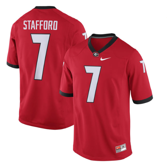
Much Georgia. Very Dawgs.
Our pals over at Barstool Western said this when the DJ Khaled video was going around that the new uniforms were reminiscent of the University of Gerogia. Well, they’re not wrong.
And, while not exactly the same look as the silver britches (WKU is without the black trim, for instance) it’s pretty close. What’s even more striking is that Nike also gave the Tops the slanted number look, which is new for this year’s uniforms.
Having said that, I don’t mean to make that sound like a complaint — I think UGA has a very slick look and, as much as I dislike the Dawgs (not the time or place to go into that), I like their look on the field. It’s just…WKU basically looks the same and that’s disappointing.
I Still Don’t Get The Houndstooth Thing
There’s no real way to talk about this without coming off as somewhat disrespectful or arrogant, so let me say this up front — I have nothing against Coach Feix. He did great things for WKU and his passing was a sad day around Bowling Green.
However, honoring him and his legacy with the houndstooth look feels…forced.
Take Alabama — they took to houndstooth almost immediately after Bear Bryant did. If houndstooth was truly a WKU tradition, it’d have been around campus far more and far longer.
I know Coach Feix wore a houndstooth hat as well, but still. It didn’t take off then, why is it being forced now?
I Really Miss The Crest Inside The Numbers
When Russell unveiled the new WKU uniforms in 2013, the best part of the design, by far, was putting the school’s crest inside the numbers.
In a move that shouldn’t be shocking, Nike has ditched that. But why? Really, why? It wouldn’t have hurt to keep it in — it at least would have been another thing to make the jersey a true Western Kentucky jersey.
What Does WKU’s Switch to Nike Mean?
Later this afternoon, WKU will announce that they are switching from longtime equipment supplier Russell Athletic to…medium.com
What We Have Seen Is What We Are Getting
I’ve had a couple of folks reach out and ask if we are getting a black jersey. At the time, I didn’t know how to answer, but I do now — no.
At least, not this year.
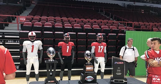
Take a look at the uniforms that were on display.
Now, take a look at the three tweets WKU football released.
Those are the combinations, and that’s what they’re sticking with. We’ll see either all white, all red or white/red top with black pants.
By the way, I really like the black pants.
Football Might Suffer For Other Sports To Flourish
If you don’t like the new football jerseys, I have something that should make you feel better — I think these will be the “worst” of the uniforms. We got a full unveil of the volleyball jerseys before yesterday’s scrimmage at Fan Fest, and we know what at least one of the soccer kits look like, and while there is certainly a uniformity from the three jerseys we’ve seen so far, it’s certainly an upgrade for volleyball and soccer, and I assume it’ll be that way across the board.
I’m expecting some F R E S H hoops unis, and I’m hoping for a good looking set of baseball and softball uniforms as well.
If Nike went cookie cutter for the football look to give everything else an upgrade, I’ll be okay with it.
Overall, my final verdict on the new look is — meh. They’re fine. They’re cookie cutter. They’re not awful, but they’re not great either. But, if the swoosh is what’s going to bring the croots (and dare I say fans?) than it’s fine by me.
You’ve had an evening to consider them — what do you think? Do you like the new look? Do you miss the Russell look? What were you wishing to see? Let us know in a comment below, via Twitter at @TheTowelRackWKU or on our Facebook page.


